Designing the Loadshare Rider app: signup, orders and earnings for delivery riders
I designed the Loadshare Rider app, which delivery workers use to sign up, take food and e-commerce orders, and track what they earn.
Loadshare Rider lets delivery workers take food and e-commerce jobs for clients like Swiggy, Magicpin, Amazon and Flipkart from one app. I worked on it from field research to V1, then redesigned key flows using real usage data, for a network that handled 250,000+ last-mile orders a day by Feb 2022.
- ROLE
- UX Design Intern, then Product Designer
- TEAM
- Product manager, a UI designer and me
- TIMELINE
- Apr 2021 to Feb 2023
- PLATFORM
- Android app for delivery riders
- COMPANY SCALE
- 250,000+ last-mile orders a day across 18 states (Feb 2022). Public reports ↗
- SCOPE
- Field research, IA, wireframes, UI, prototyping, usability testing, handoff, usage analysis
- TOOLS
- Figma, Whimsical, Notion, Mixpanel, Smartlook
Riders could not see how the job paid
Loadshare's promise to riders was simple: one app, many delivery jobs, more earnings. But a rider only stays if they can sign up, understand the work and trust the money. Riders were losing out on all three.
For the business, each confused rider is a rider who leaves for another platform, and fewer riders means slower deliveries for clients.
Make one app that lets any rider sign up alone, deliver confidently and always know what they have earned, across food and e-commerce jobs?
Riding along with delivery workers
I interviewed and shadowed riders on real deliveries in Kerala, Karnataka, Kolkata, Delhi and Dehradun, and tested early wireframes with them. Four problems came up again and again:
- Understanding the core delivery flow, from accepting an order to confirming delivery
- Seeing earnings clearly
- Fitting shifts around their day
- Understanding the rate card and incentive slabs
| RIDER | EXPERIENCE | WHAT GETS IN THE WAY |
|---|---|---|
| RENJITH, 22 | New to delivery | Needed friends' help just to sign up; doesn't know how a delivery works |
| RAHUL, 23 | 3 months, food and e-commerce | Can't track earnings per order or read the rate card |
| VENKATESH, 26 | 4 years, two platforms | Chases a daily target; location issues cause delays and cost him money |
| NISHAD, 32 | 3.5 years, one platform | Stays for better pay per order, but wants to try other delivery types |
I compared SFX, Dunzo, Swiggy, Zomato and Rapido on 9 rider features. Two stood out:
Both became part of the Loadshare app.
 SFX
 Dunzo
 Swiggy
 Zomato
 Rapido
Put the money where riders look first
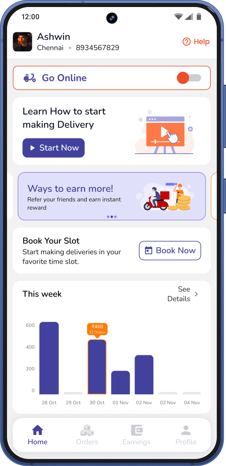
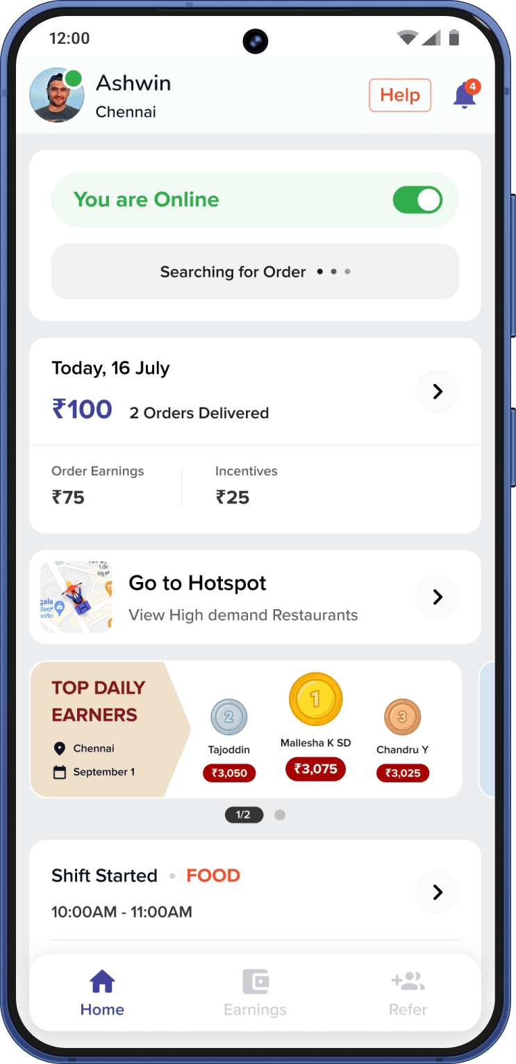
Earnings were the top worry in every city, so I made money the first thing on Home and gave it its own tab.
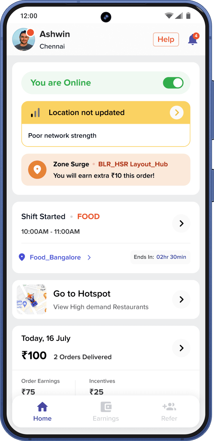
- Home shows today, not just the week. V1 led with a weekly earnings chart. The redesign leads with today's total, split into order earnings and incentives, because riders like Venkatesh plan around a daily target.
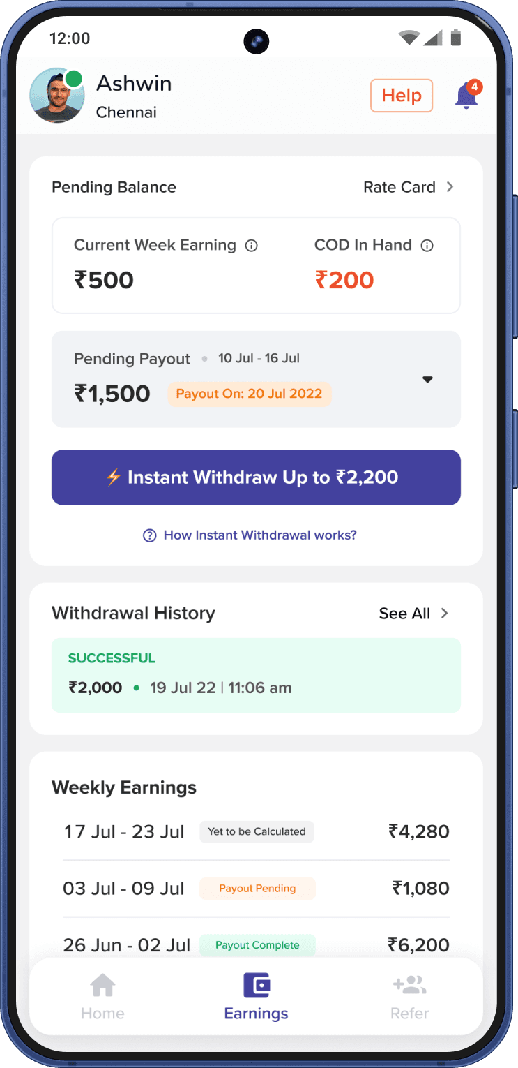
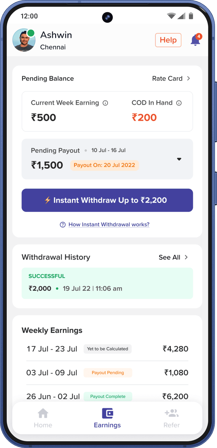
- The Earnings tab answers every money question: this week's earnings, cash on delivery in hand, pending payout with its date, withdrawal history and a weekly breakdown, with the rate card one tap away.
- Instant withdraw: riders can take out earnings before the weekly payout, a feature only two of five competitors offered.
Let riders join on their own, and practise before a real order
New riders like Renjith needed friends to sign up. I designed onboarding so a rider can go from download to first order alone.
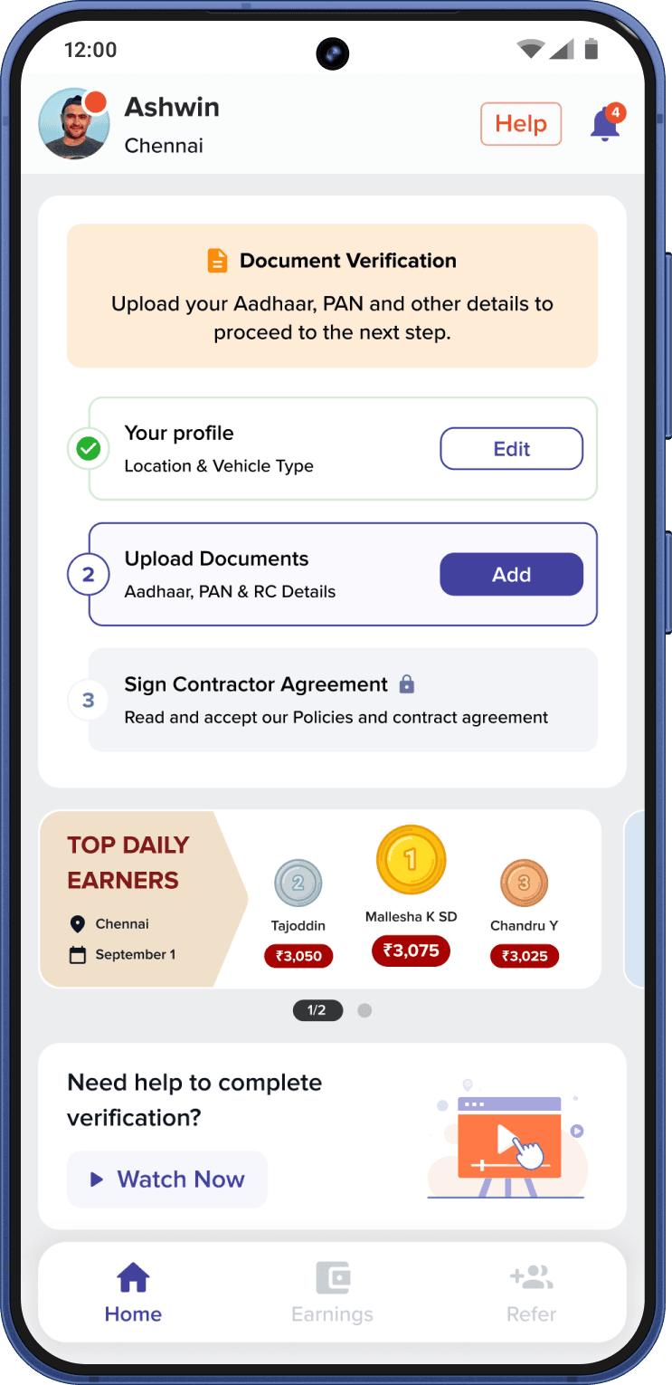
- Check fit first: signup asks for city, work area and delivery type up front, so riders in areas without jobs find out before doing KYC.
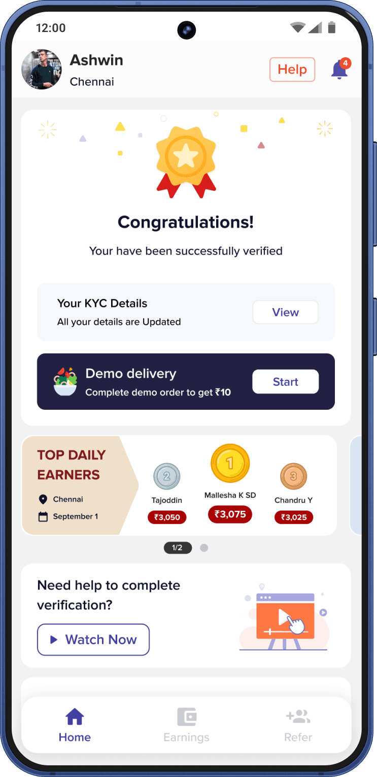
- KYC as clear steps: Aadhaar, PAN, vehicle RC and driving licence, each with its own status, and "Do it later" for the profile photo so it never blocks progress.
- Practise in the app: after verification, riders do a demo delivery and can watch help videos. None of the five competitors had an in-app demo.
RESULT · Signup conversion went up after the redesign. The exact figures are under NDA.
Design for someone on a bike
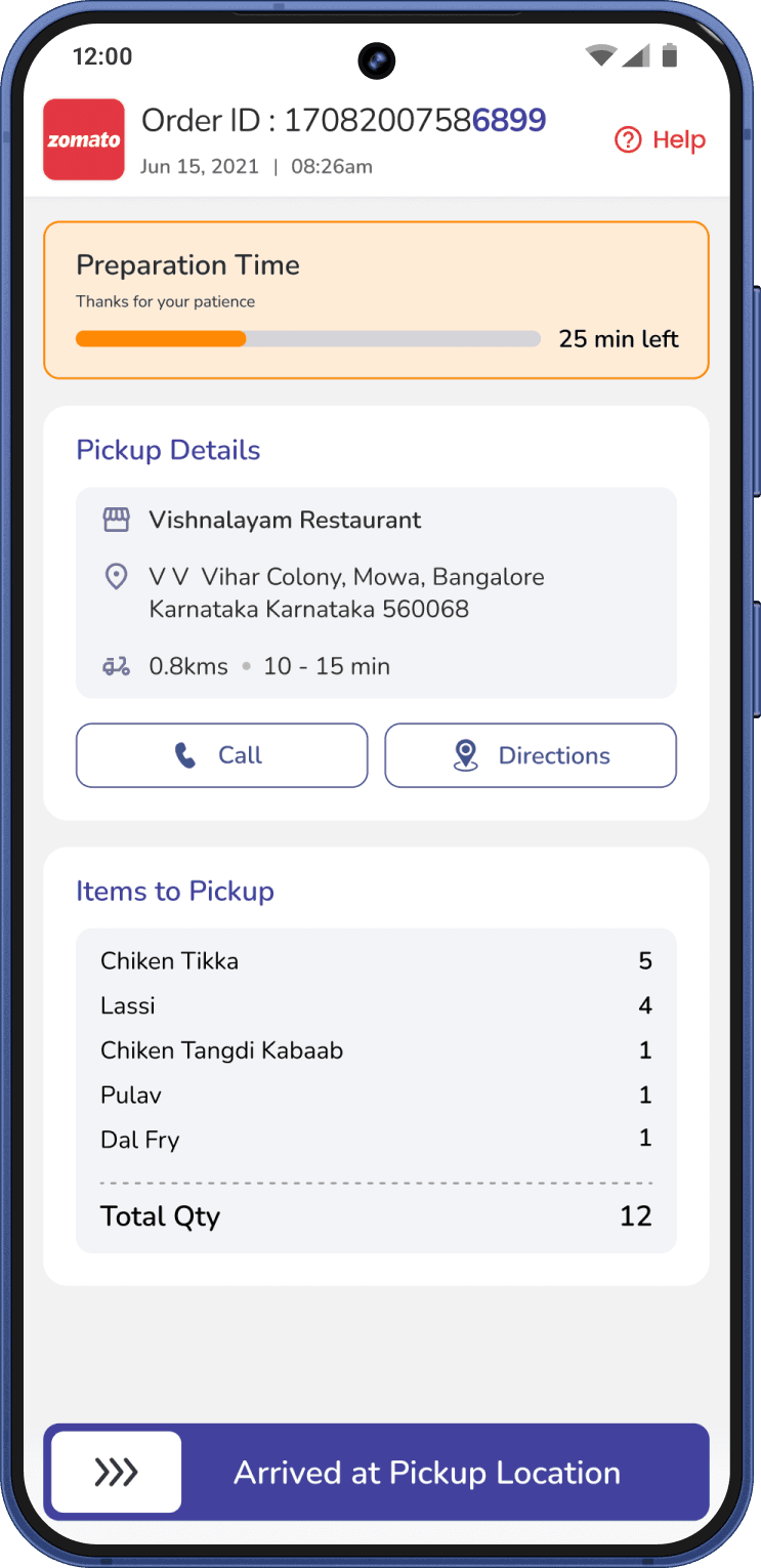
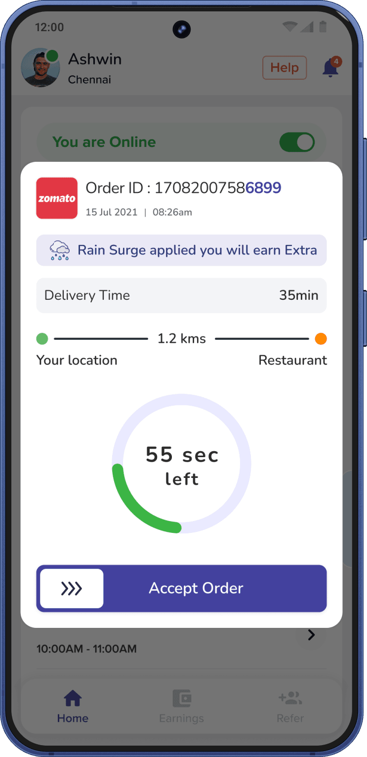
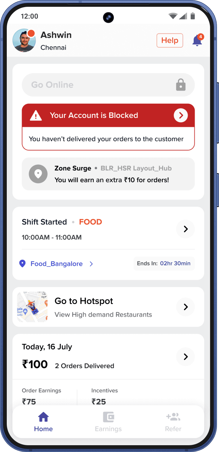
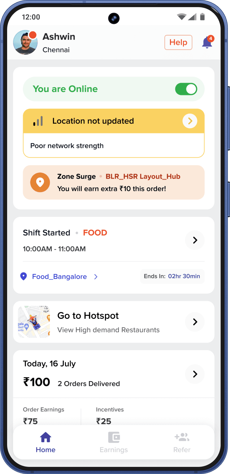
Riders use the app outdoors, in a hurry, often with one hand. Every key action was designed for that.
From V1 to a data-led redesign
The work ran in five phases: research, personas and journeys, IA and wireframes, V1 release with usability testing, then a redesign driven by real usage data.
After V1 launched, I used Mixpanel and Smartlook to see where riders dropped off or got stuck. The detailed numbers are under NDA, but the changes they led to are visible:
| AREA | V1 | AFTER THE DATA REVIEW |
|---|---|---|
| HOME | Weekly earnings chart and banners | Today's earnings split, shift, surge zones and a status widget |
| EARNINGS | List of weekly payouts | Full earnings tab with cash in hand, pending payout and instant withdraw |
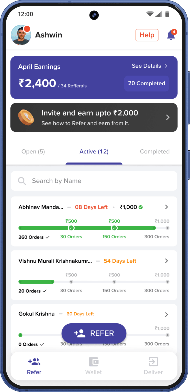
| GROWTH | Referral banner on Home | Refer and earn with progress for each referred rider |
Five flows, from first signup to payout
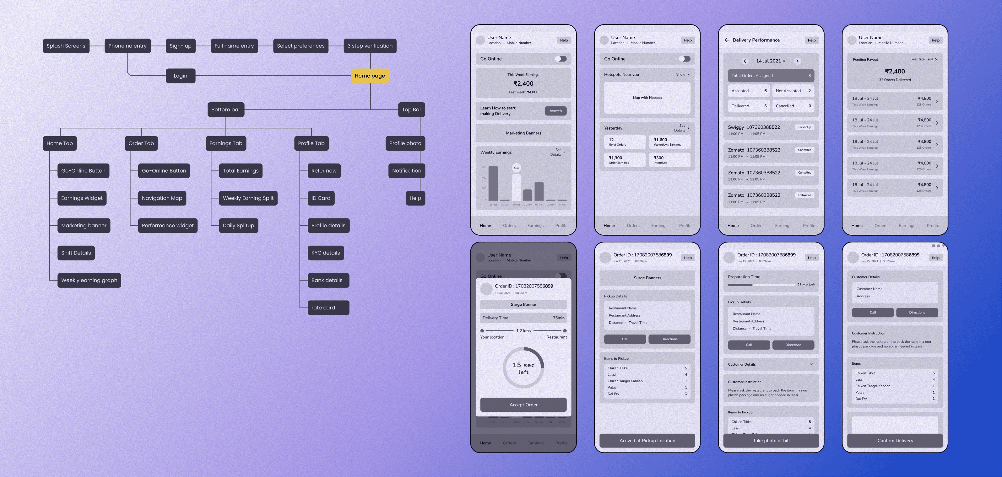
Riders could sign up alone, see their money and get on with the job.
Signup conversion went up after the onboarding redesign (exact figures are under NDA). By Feb 2023 the app had 100K+ downloads and a 4.3★ rating from 4.83K reviews.
Keep my own before and after numbers. The detailed data is under NDA, so today I can't show how much each change helped. Next time I'd record one simple metric per change that I'm allowed to share.
Test the order flow on the road, not only at a desk. Most usability tests happened before or after rides. Testing during real deliveries would catch more one-hand and sunlight problems.
Validate personas with more riders. The four personas came from a limited set of interviews; a wider sample would make them stronger.
For gig workers, trust in money is the product. Clear earnings did more for riders than any new feature.
Field research changes what you build. Shadowing riders showed problems no screen review would have found.