Test any website on every device, under real settings
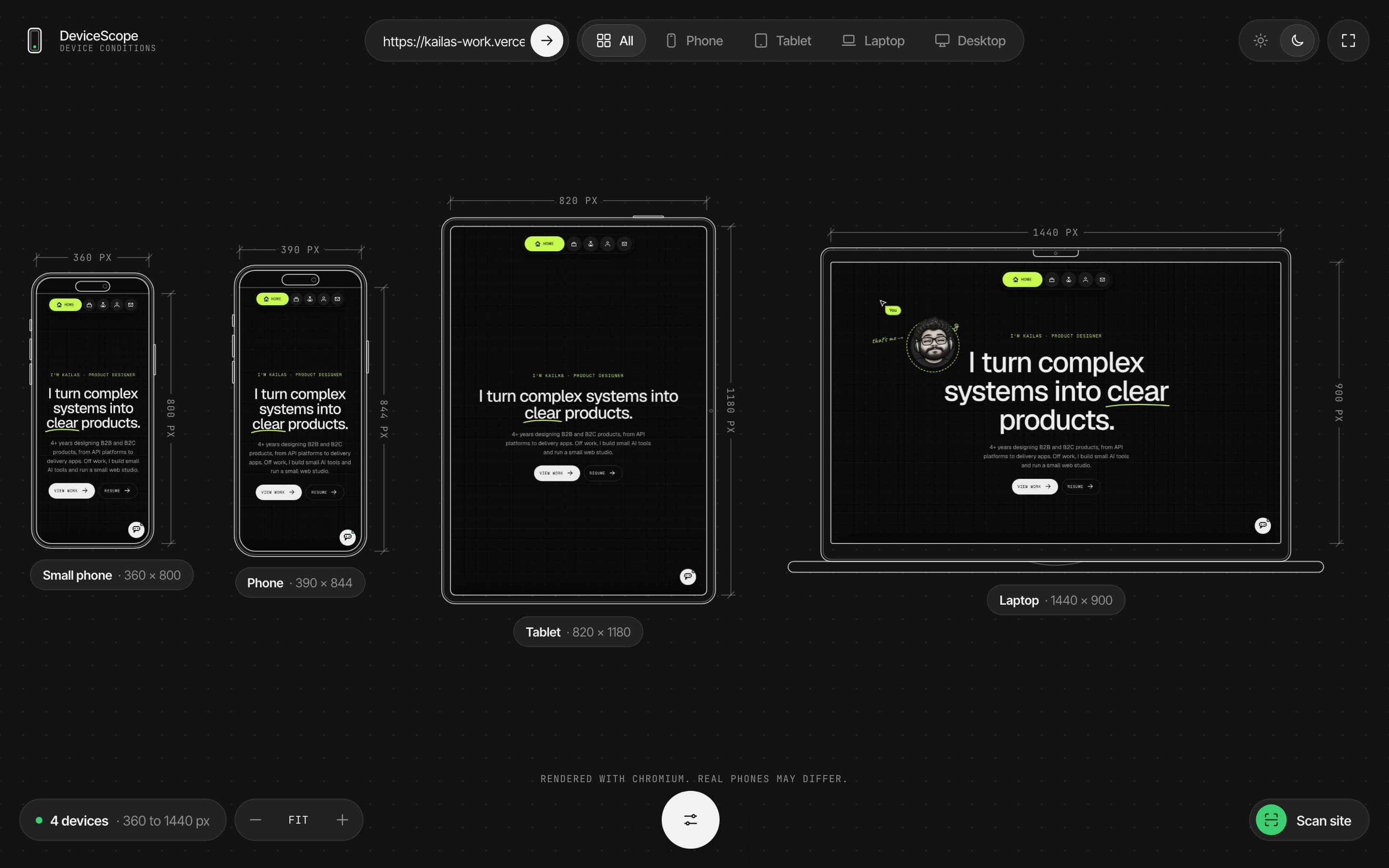
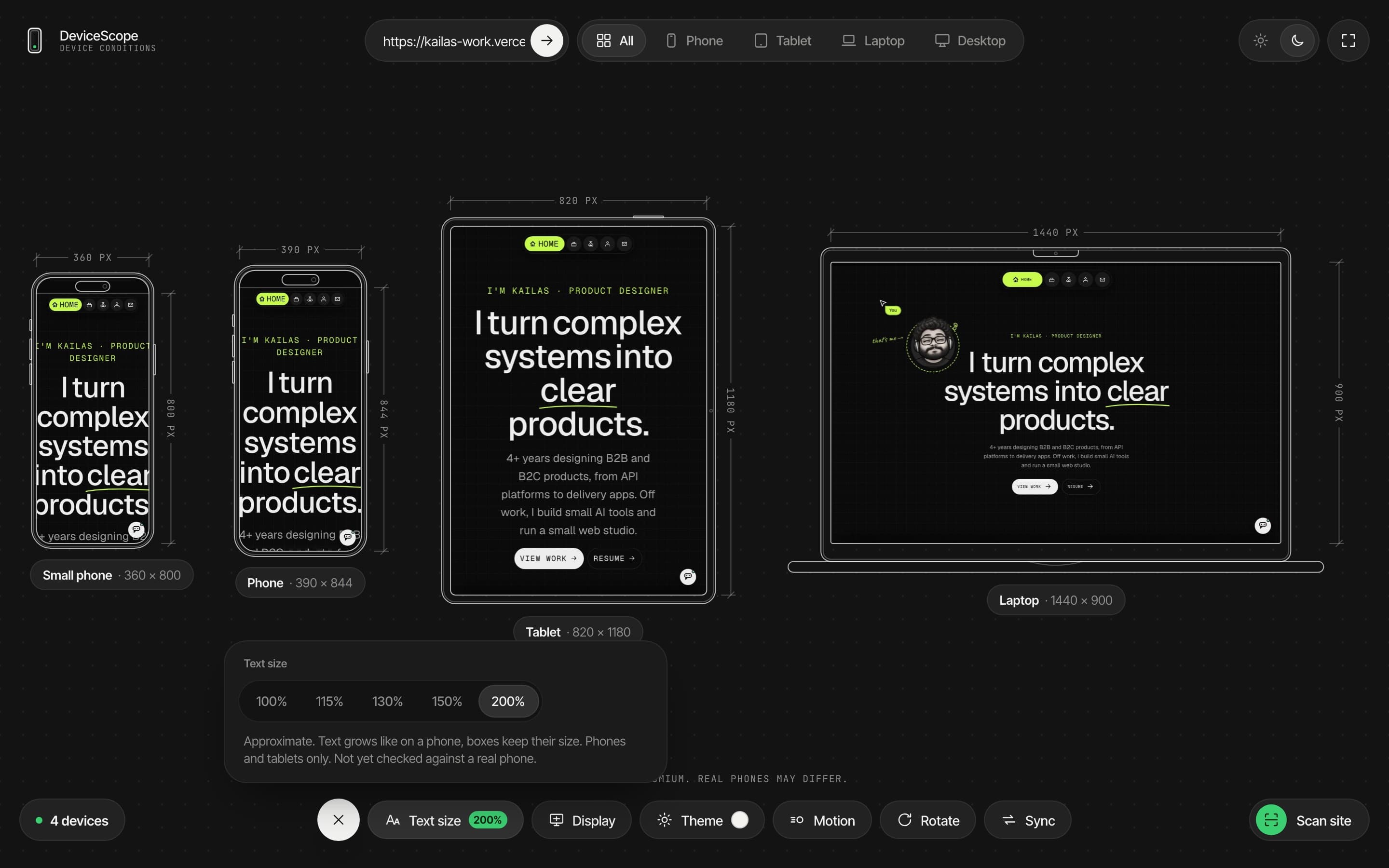
Paste a link to any website or web app. See it live on phones, tablets and laptops side by side, with real settings like big text and dark mode, and find the layout problems.
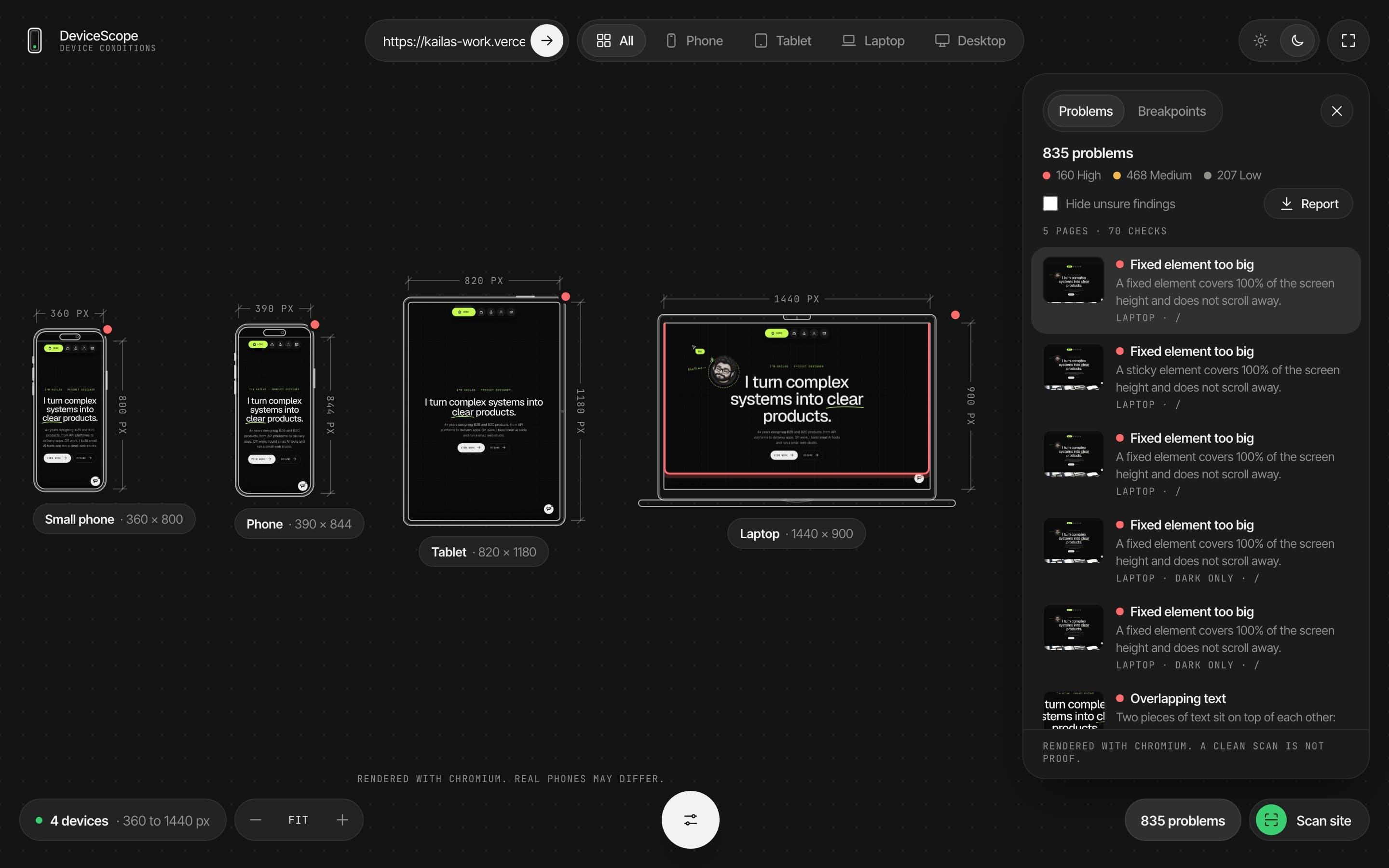
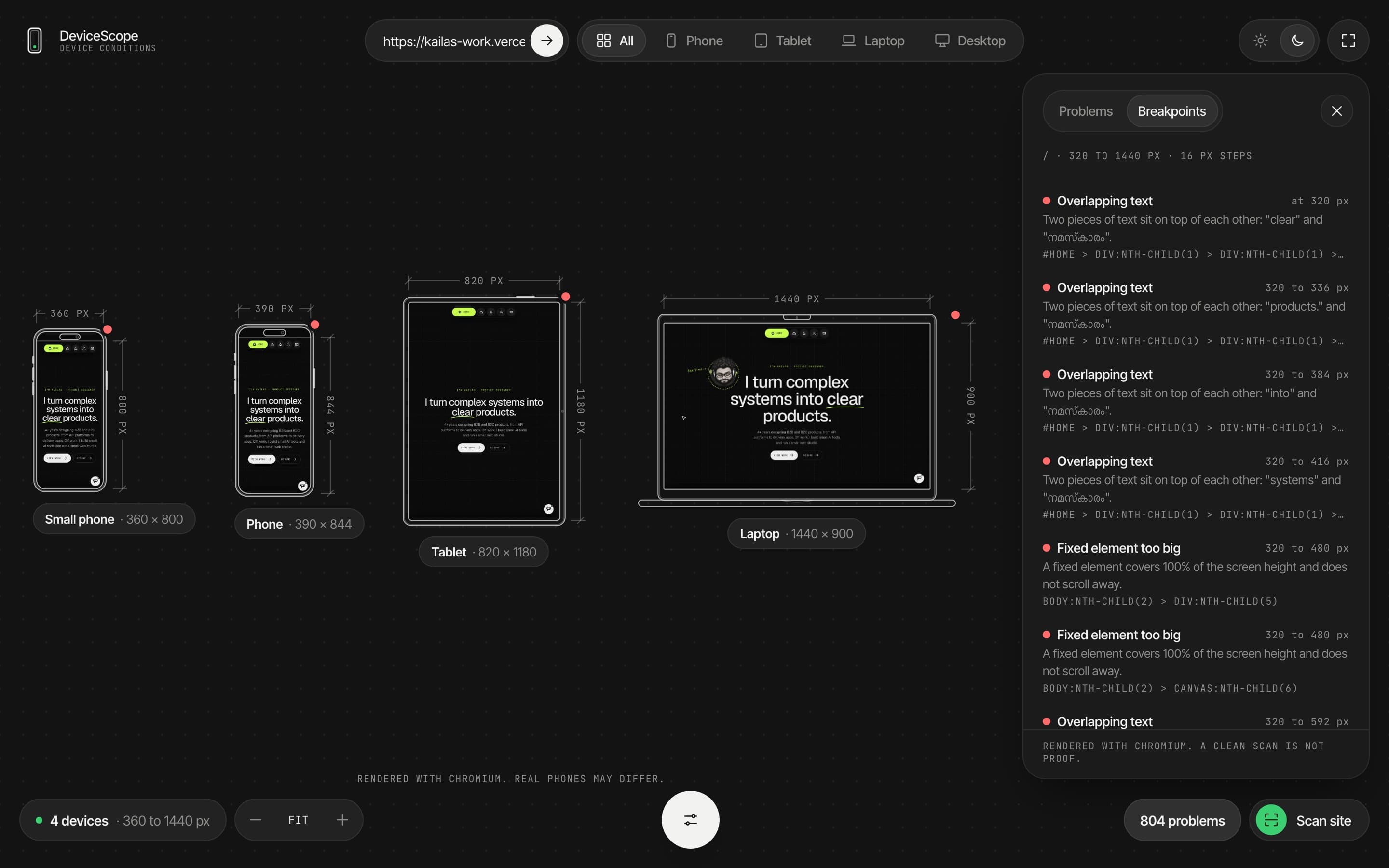
Most responsive checks only change the screen width. Real people also make text bigger, change display size, use dark mode or turn off motion, and those settings break layouts. DeviceScope is a tool I'm building to test all of that at once. Every screen on this page is DeviceScope running on this portfolio.
- ROLE
- Designer and builder (personal project)
- TIMELINE
- Oct 2026, in progress
- PLATFORM
- Web app
- TOOLS
- React, TypeScript, Playwright, Claude Code
- TRY IT
- Not public yet Build status →
Phones change more than the width
Browser dev tools let you drag the window narrower. But a phone set to large text, or a bigger display size, is a different screen. Headings run off the edge, buttons overlap, and fixed bars cover half the page.
Nobody owns every phone to check this. The tools that exist show one device at a time, and most of them skip these settings completely.
How might we let anyone see a site on every device and phone setting at once, and find what breaks before their users do?
Live devices, real conditions, then a scan
A report you can send
One file that opens offline. Each problem lists the device, the page, when it shows up and the element, with a marked picture.
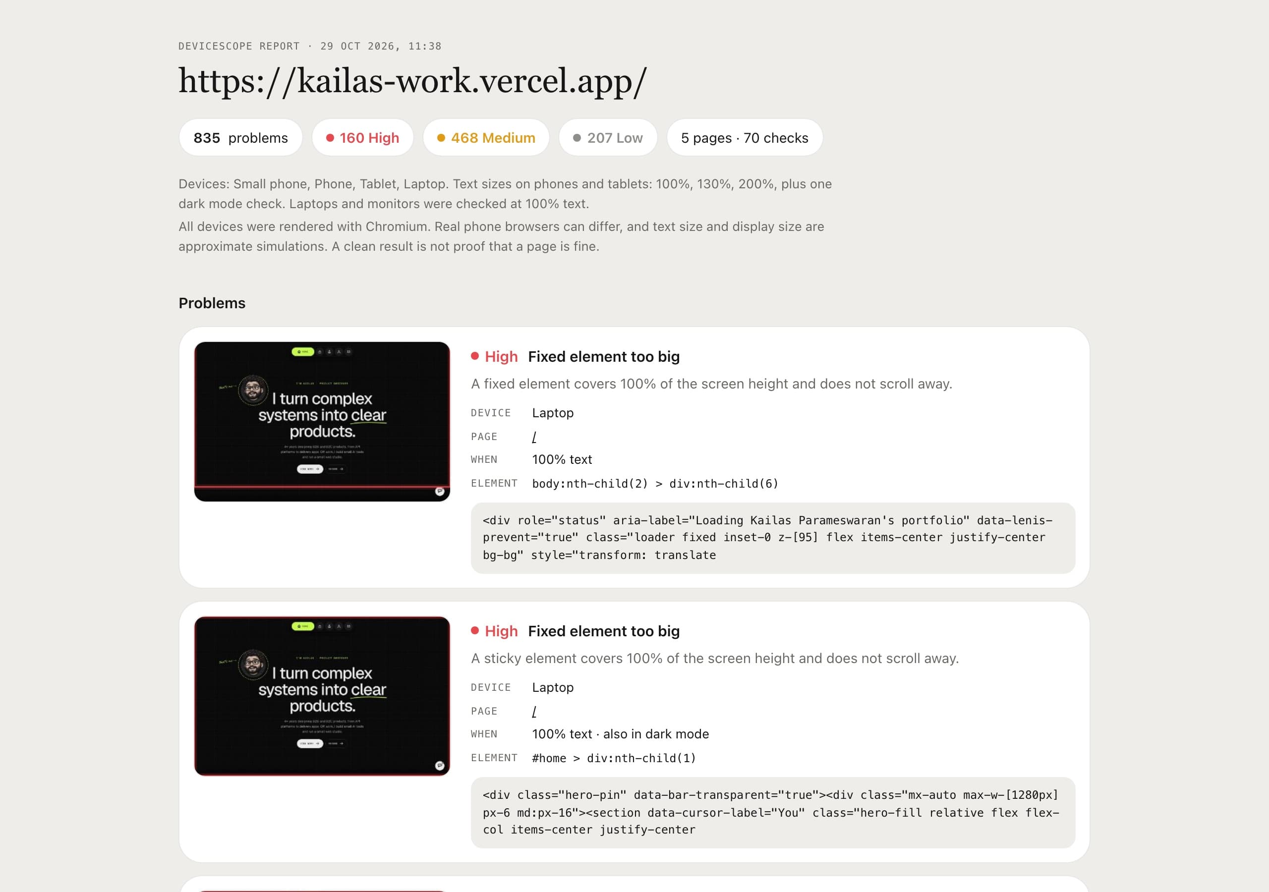
HONEST LIMITS · Every device renders with Chromium, so Safari on iPhone can differ. Text size and display size are close simulations, not exact.
Still being built
- Now: a first working version, tuning the scanner so it raises fewer false alarms.
- Next: many more devices at once, running on a server, so anyone can try it from the browser.